Climate and Energy, reading how heat waves, power, and data centers reshape daily life and costs
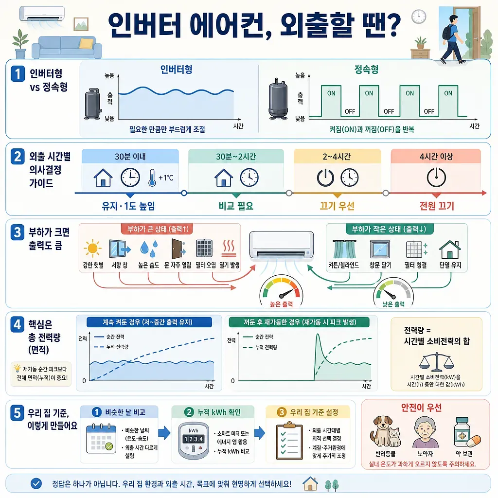
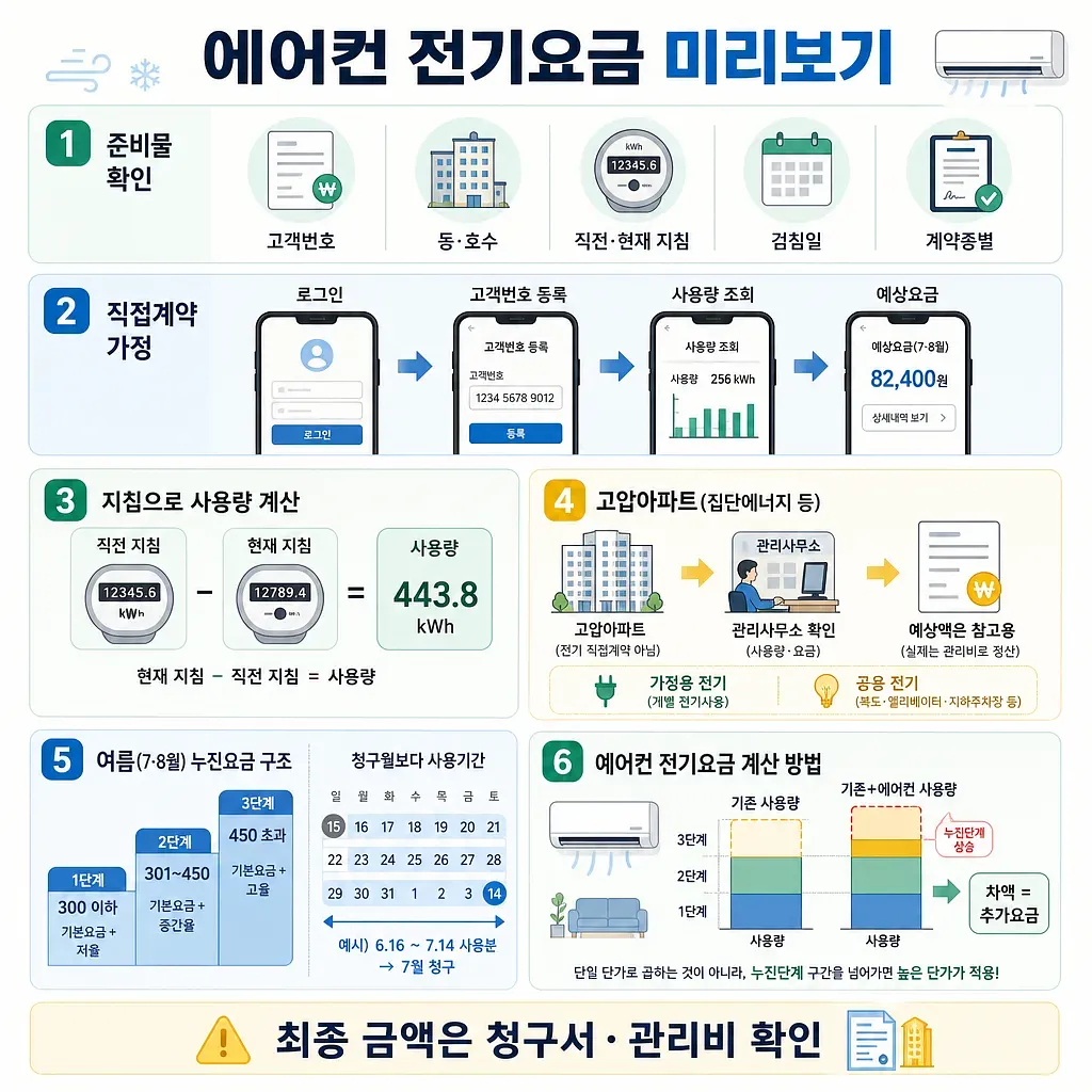
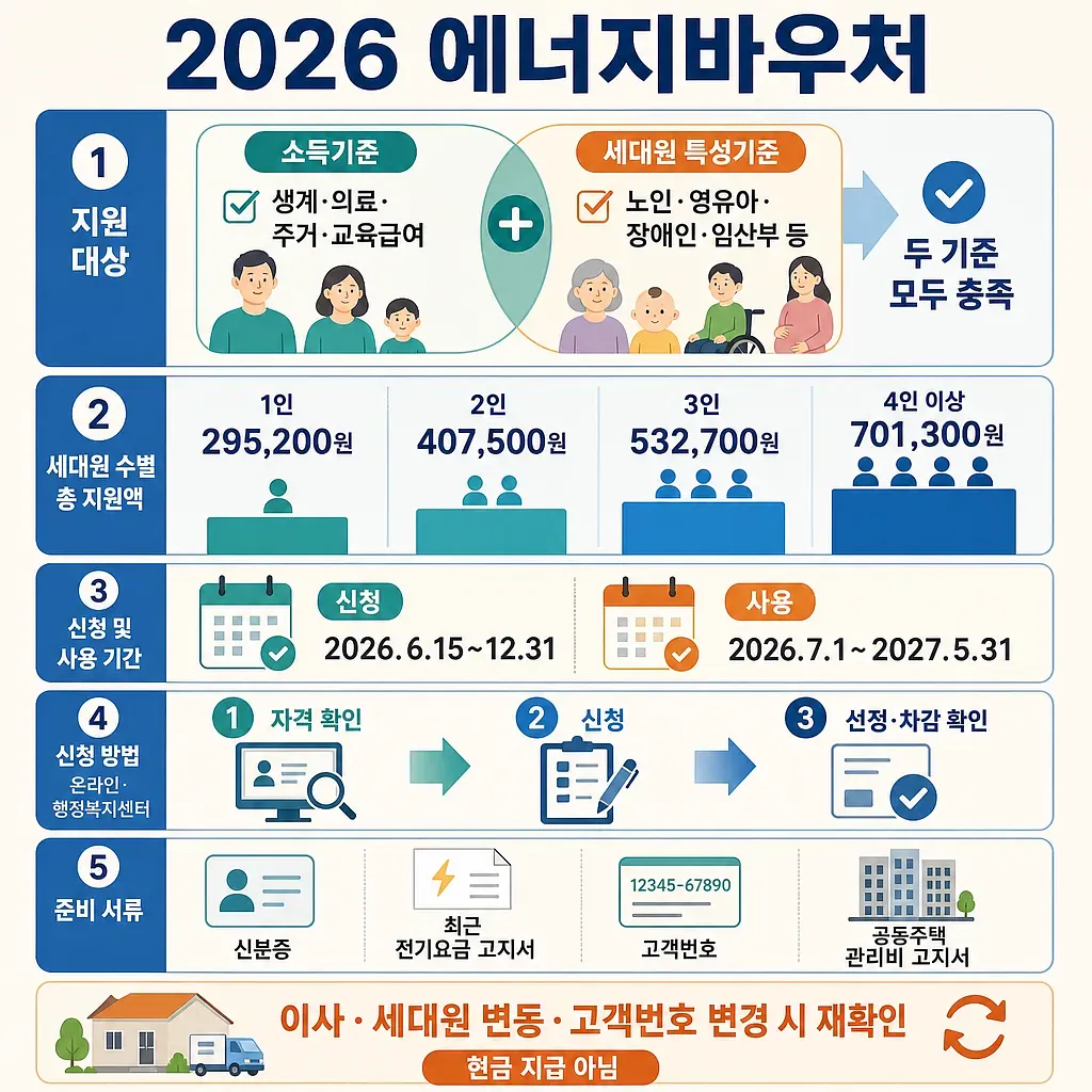
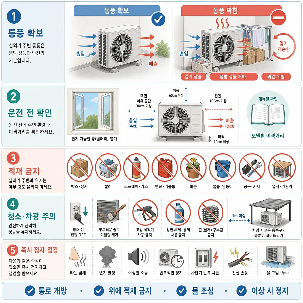
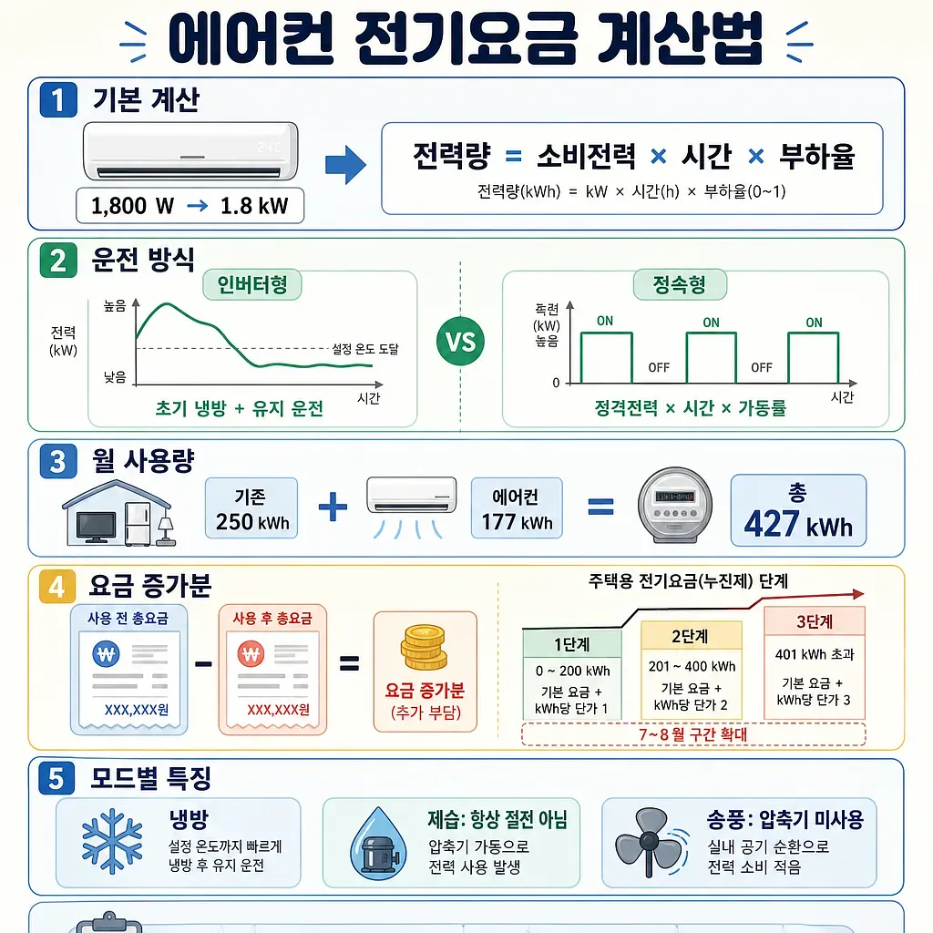
Climate stories sound distant, yet they arrive very close by way of the bill. Here we read with data how heat waves, extreme weather, power demand and prices reach daily life and cost.
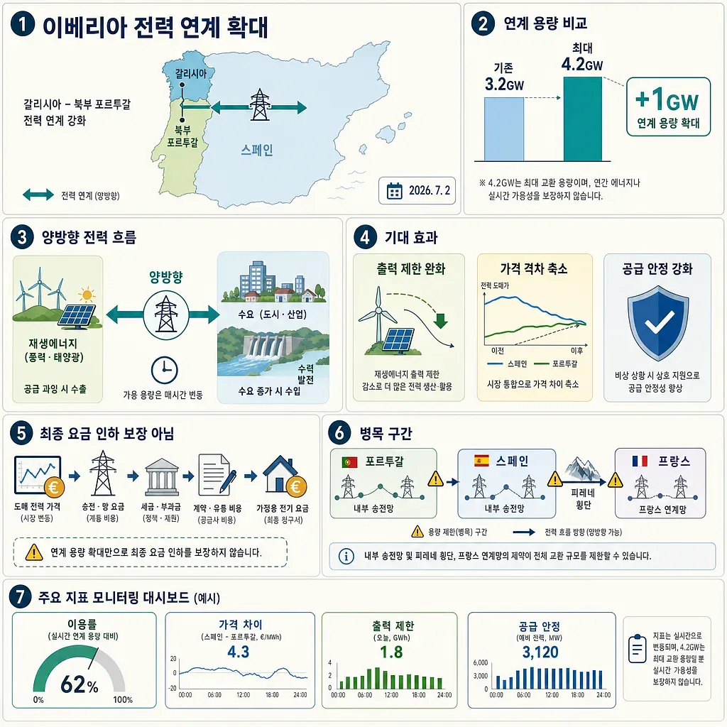
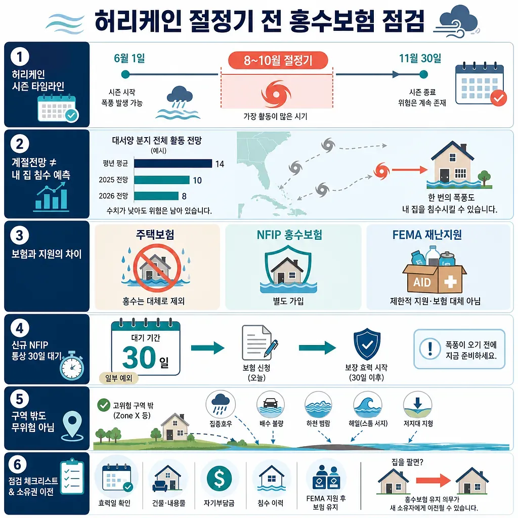
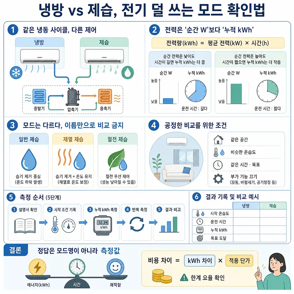
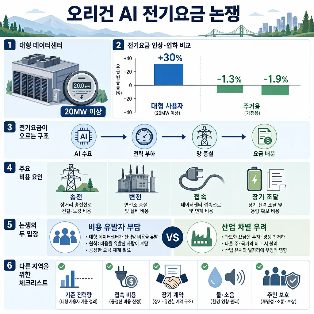
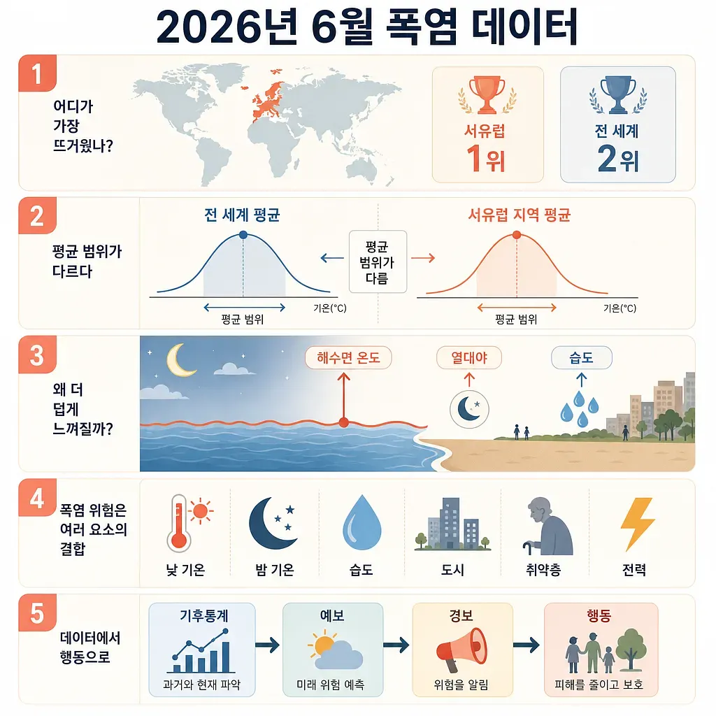
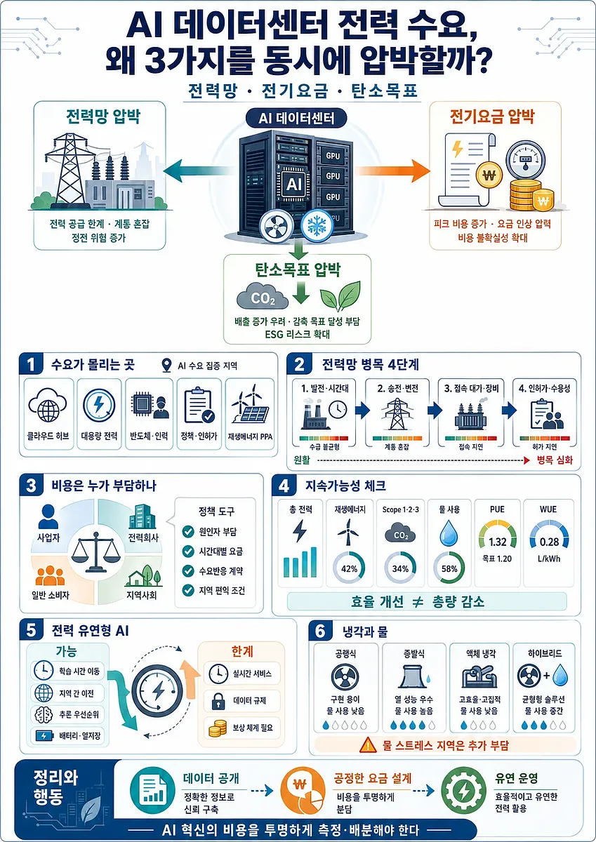
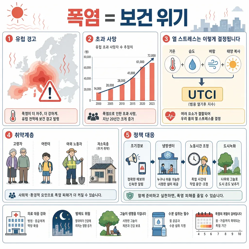
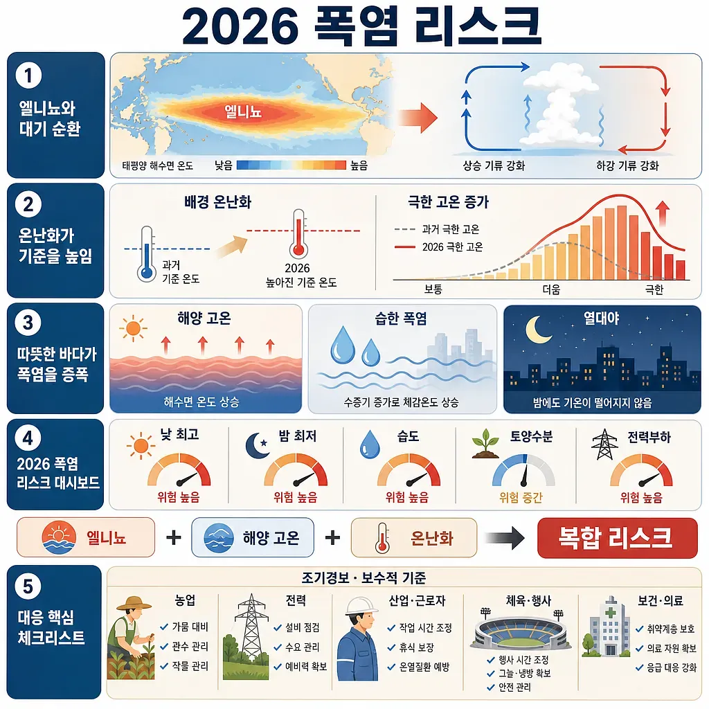
We cover El Niño and rising sea temperatures, record heat and heat-related illness, summer and winter demand peaks and tariff design, the load AI data centres add to the grid, and how renewable build-out and net-zero targets are actually progressing.
We look at confirmed numbers before forecasts. Starting from things you can verify - temperature records, consumption figures, the bill itself - we work out where the trend is heading.
42 posts

Subscribe to the newsletter
Get new articles and binder updates by email every day. Issues may also include affiliate products and articles about them (advertising).
Request content
Can't find what you're looking for? Request a topic and we'll create it after review.
Request contentContent API
Serve our reviewed content in 5 formats such as JSON and Markdown, in multiple languages. Start free with an API key.
Explore the APINo infographics are available in the current language, so infographics in all languages are shown.