Injoys

On-site marketing is the practice of designing a website’s internal messages, screen layouts, recommendations, benefits, and consultation paths so that visitors arriving through ads or search can find the information they need and make informed decisions. The goal is not to pressure visitors into making a purchase at all costs, but to increase the likelihood of conversion by reducing uncertainty and the cost of exploration.
It is difficult to treat average site conversion rates or popup contribution rates as universal figures that apply across all industries. Product prices, purchase cycles, acquisition channels, the proportion of new customers, and definitions of conversion all differ. External benchmarks should be used only as reference points, and results should be compared between your own exposed and control groups.
What Is On-site Marketing?
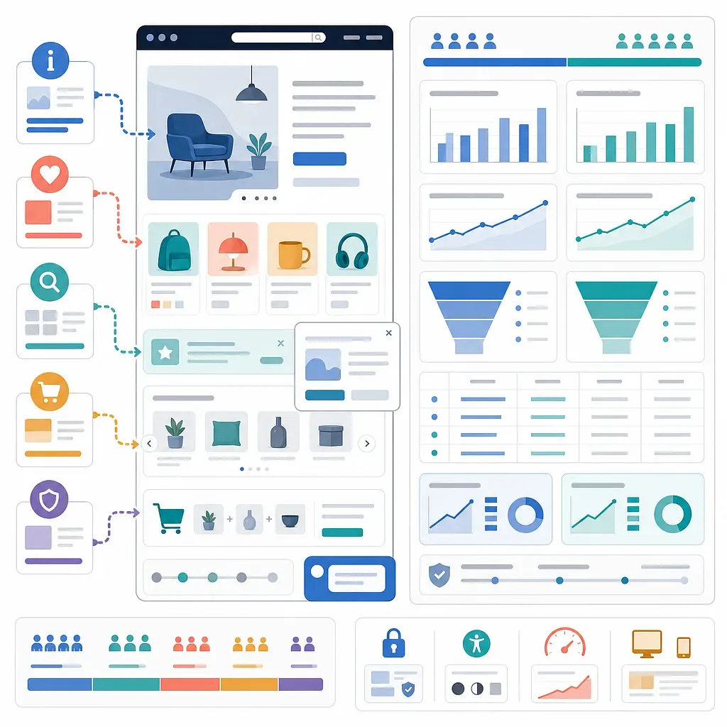
While off-site marketing brings visitors in through external touchpoints such as search, advertising, social media, and partnerships, on-site marketing manages the experience after they arrive.
| Category | Off-site Marketing | On-site Marketing |
|---|---|---|
| Main touchpoints | Search results, advertising platforms, social media, email | Homepage, product detail pages, shopping cart, checkout screens |
| Primary purpose | Reach, awareness, traffic acquisition | Exploration support, conversion, improving average order value and repeat visits |
| Common methods | Search ads, content, display ads | Popups, banners, recommendations, consultations, cart notifications |
| Key metrics | Impressions, click-through rate, acquisition cost | Conversion rate, revenue per visitor, average order value, bounce rate |
On-site marketing and conversion rate optimization (CRO) overlap, but they are not the same. On-site marketing refers to specific interventions shown to visitors, while CRO is a broader improvement process that includes problem diagnosis, hypothesis development, experimentation, and analysis. CRM is connected to on-site personalization because it uses customer identification information and purchase history.
What to Define Before Getting Started
Standardize the Meaning of Conversion First
Conversion differs by site. For an online store, the primary conversion may be a completed payment; for a subscription service, a trial signup; and for a high-consideration product, a consultation booking. Mixing session-based and user-based conversion rates in a single report makes results difficult to compare.
- Conversion rate = Number of conversions ÷ Number of sessions or users
- Average order value (AOV) = Revenue ÷ Number of orders
- Revenue per visitor (RPV) = Revenue ÷ Number of visitors
- Related purchase rate = Number of orders containing recommended products ÷ Number of orders exposed to recommendations
- Exit-prevention conversion rate = Number of conversions after exposure to an exit-prevention message ÷ Number of exposures to that message
The denominator, aggregation period, and criteria for handling cancellations and returns should all be documented in the metric definition guide.
Distinguish Between Visitor States
Showing the same popup to every visitor creates message conflicts and fatigue. At a minimum, it is advisable to distinguish between the following states:
- New and returning visitors
- Members and non-members
- First-time customers and existing customers
- Visitors browsing products and visitors with items in their carts
- Acquisition channels such as advertising, search, and email
- Mobile and desktop environments
For new visitors without sufficient data for personalization, it is safer to provide universal information such as popular products, clear categories, and return policies rather than making excessive assumptions.
5-Step Implementation Process
1. Communicate Benefits and Essential Information
Popups, top bar banners, and floating UI elements prominently communicate information needed for purchase decisions, such as discounts, shipping, event deadlines, and member benefits.
Appropriate Use Cases
- Inform non-members about signup benefits and eligibility requirements
- Inform new customers about first-purchase benefits
- Display event deadlines based on the actual end time registered on the server
- Pin a cart or consultation button to the bottom of mobile screens
Context matters more than exposure volume for popups. Instead of covering the entire screen immediately after a visitor arrives, a popup can be shown after the visitor has browsed products to a certain extent or met relevant conditions. The number of exposures per session and the interval before showing the popup again after it is closed should also be defined.
Claims that purchases made through popups account for a certain percentage of total purchases can vary greatly depending on the tool’s attribution model. A control group that does not see the message is needed to determine whether the people who saw the popup would have made a purchase anyway.
2. Provide Evidence That Supports Decisions
Visitors who are hesitant to purchase can be shown deadlines, inventory levels, terms of use, and ratings from other customers. However, persuasive information must be based on verifiable facts.
- Countdown: It must match the actual event end time and must not reset when the page is refreshed.
- Inventory notice: It should be integrated with the actual inventory system and account for inventory changes such as reservations and returns.
- Sales and viewing data: The aggregation period and any data latency should be clearly stated.
- Free-shipping progress indicator: It should show the difference between the current cart amount and the free-shipping threshold.
- Reviews and ratings: Negative ratings should not be hidden, and the submission and verification criteria should be disclosed.
False purchase notifications, deadlines that continually reset, and inventory made to appear lower than it actually is can become deceptive interfaces rather than social proof. Even if short-term clicks increase, trust, refund rates, and long-term customer value may deteriorate.
A free-shipping progress indicator can encourage additional purchases, but shipping costs and product costs must also be considered. Rather than setting the threshold arbitrarily, design it by analyzing the distribution of existing order values and contribution margins.
3. Make Product Exploration Easier
The more products there are, the easier it is for visitors to forget products they previously viewed or leave during the comparison process. Recently viewed products, comparison features, search autocomplete, and recommendation modules reduce these exploration costs.
Differences Between Recommendation Methods
| Method | Data Used | Advantages | Considerations |
|---|---|---|---|
| Recently viewed products | Individual viewing history | Relatively easy to implement and understand | Consider shared devices and consent to storage |
| Products viewed together | Browsing patterns across multiple visitors | Useful for discovering comparison candidates | Results may be unstable when traffic is low |
| Products purchased together | Order combinations | Suitable for suggesting related purchases | May be biased toward popular products |
| Personalized recommendations | Viewing, purchase, and preference data | Can increase relevance for each customer | Requires data quality, explainability, and privacy management |
| Rule-based recommendations | Category, inventory, and price rules | Can operate even with limited data | Potential rule-management costs and overexposure |
Recommendation quality should not be judged solely by click-through rate. The purchase rate after clicking a recommendation, return rate, exposure rate of out-of-stock products, recommendation diversity, and revenue per visitor should also be examined.
4. Increase Order Value
Common ways to increase average order value include cross-selling, upselling, and bundle offers.
- Cross-selling: Suggest complementary products used with the product being viewed. For example, compatible memory cards and bags can be suggested for a camera.
- Upselling: Compare and present higher-tier options with greater capacity, more features, or broader warranty coverage.
- Bundle offers: Group products that are needed together and disclose differences in price and composition compared with purchasing them separately.
Recommendations should be placed where they do not interfere with decision-making. On product detail pages, it is appropriate to explain compatibility and differences; in the shopping cart, it is appropriate to suggest only a small number of complementary products that do not obstruct checkout.
If average order value rises while conversion rate falls significantly, overall performance may worsen. Revenue per visitor, contribution margin, discount costs, and cancellation and return rates should be compared together. An increase in a single order value is not the same as customer lifetime value (LTV); repeat purchases and retention rates must also be examined to determine whether LTV has improved.
5. Address the Causes of Exit
An exit-prevention message is not a tool for retaining everyone who is about to leave, but a means of removing solvable obstacles at the right moment.
- When there are products in the cart but checkout is not proceeding, remind the visitor about shipping costs and return policies.
- When product comparisons continue for a long time, provide a comparison table or consultation path.
- For expensive, high-consideration products, offer chat, phone, or scheduled consultations.
- Offer limited first-purchase benefits only to new customers.
- If errors recur, show instructions for resolving payment failures and customer support channels before offering a discount.
Exit intent on desktop can be inferred from mouse movement, but the same signal cannot be used on mobile. Mobile relies on indirect signals such as navigating back, screen inactivity, or remaining idle for an extended period, so the possibility of false positives must be considered.
There is no universally correct answer for how many minutes to wait before showing a cart notification. Analyze the average consideration time and checkout duration by product, form an initial hypothesis, and then test it. Notifications shown too quickly interfere with visitors who are considering their options normally or reading information.