Infographics
A collection of infographics that pack information into a single image. Click an image to enlarge it.
No infographics are available in the current language, so infographics in all languages are shown.
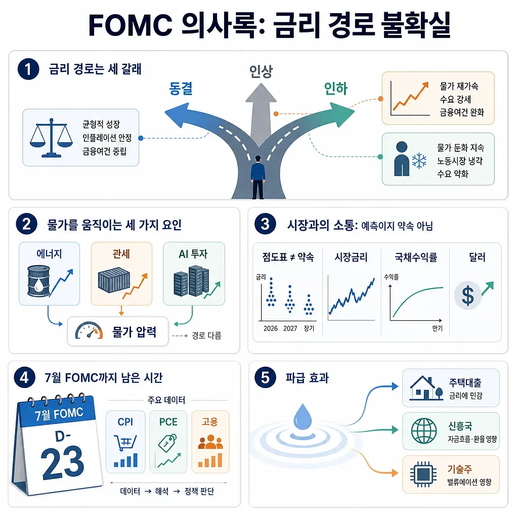
The infographic summarizes possible Fed rate paths, inflation drivers, market signals, and spillover effects.
Reading the First FOMC Minutes Under Chair Wash: Why the U.S. Interest Rate Path Has Become Uncertain Again
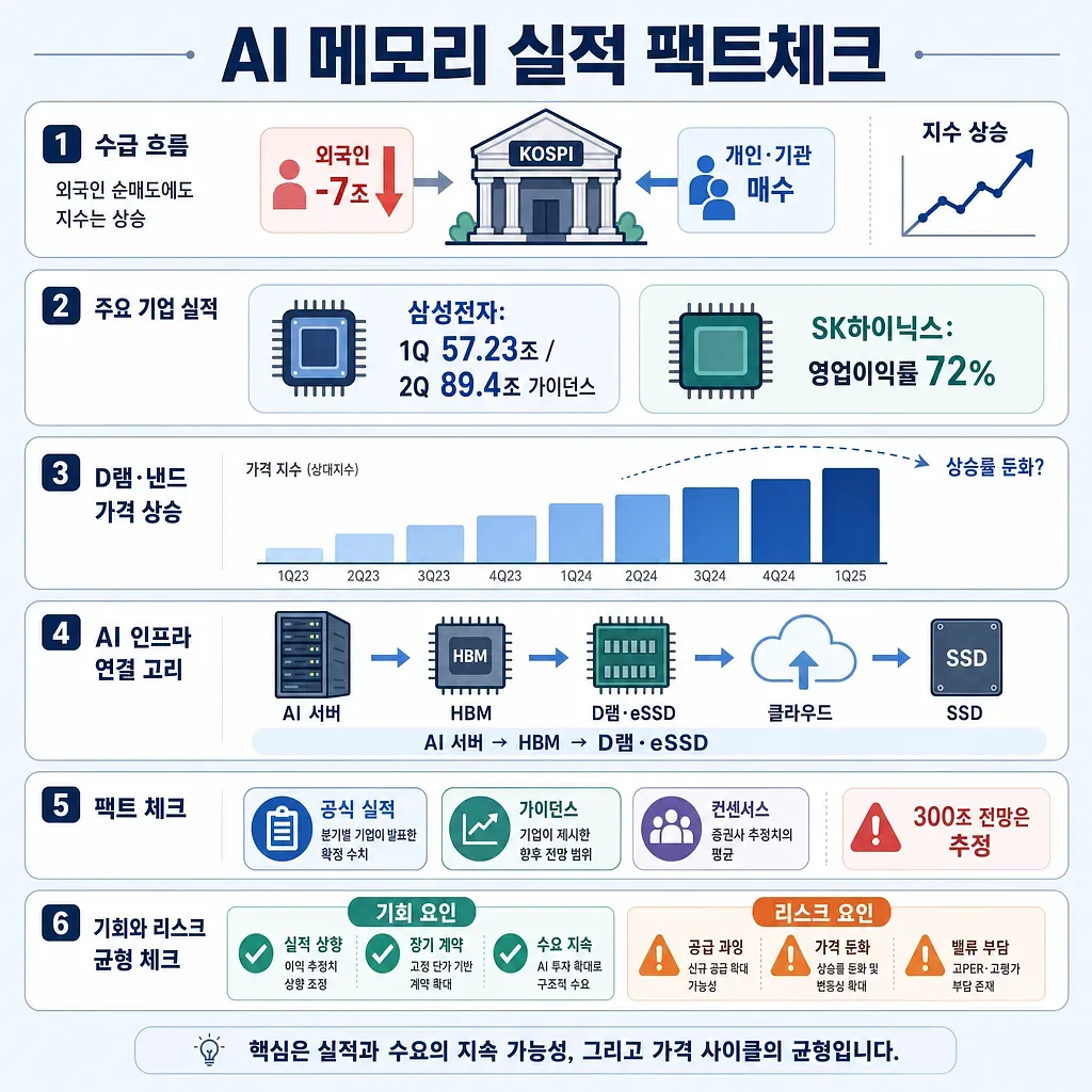
The graphic summarizes KOSPI flows, Samsung and SK Hynix results, memory prices, and AI demand links.
Foreign Investors Sell 7 Trillion Won Worth of Samsung Electronics and SK Hynix Shares; Fact-Check on AI Memory Earnings
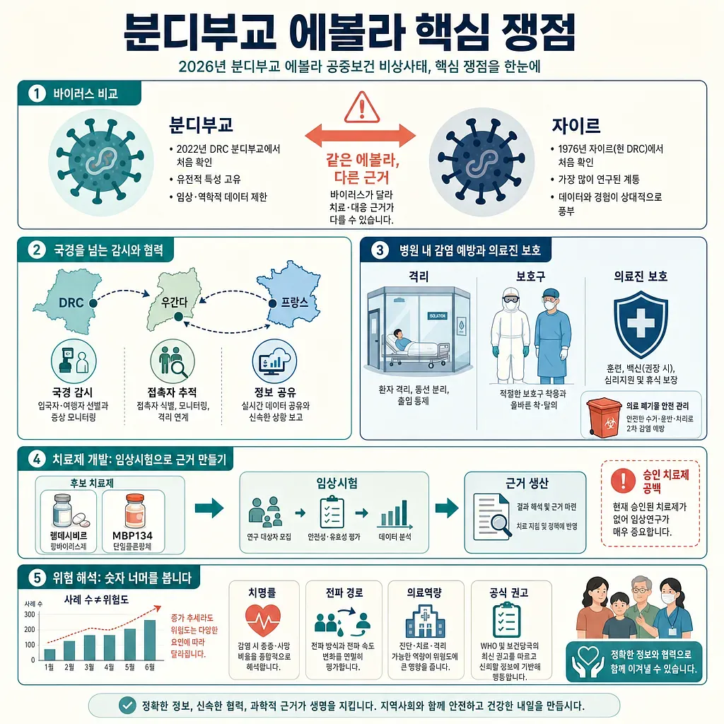
The infographic outlines virus comparison, cross-border surveillance, hospital infection control, and treatment trials.
The Spread of Ebola in Bundibugyo and Clinical Trials of Antiviral Drugs: Key Issues in the 2026 Public Health Emergency
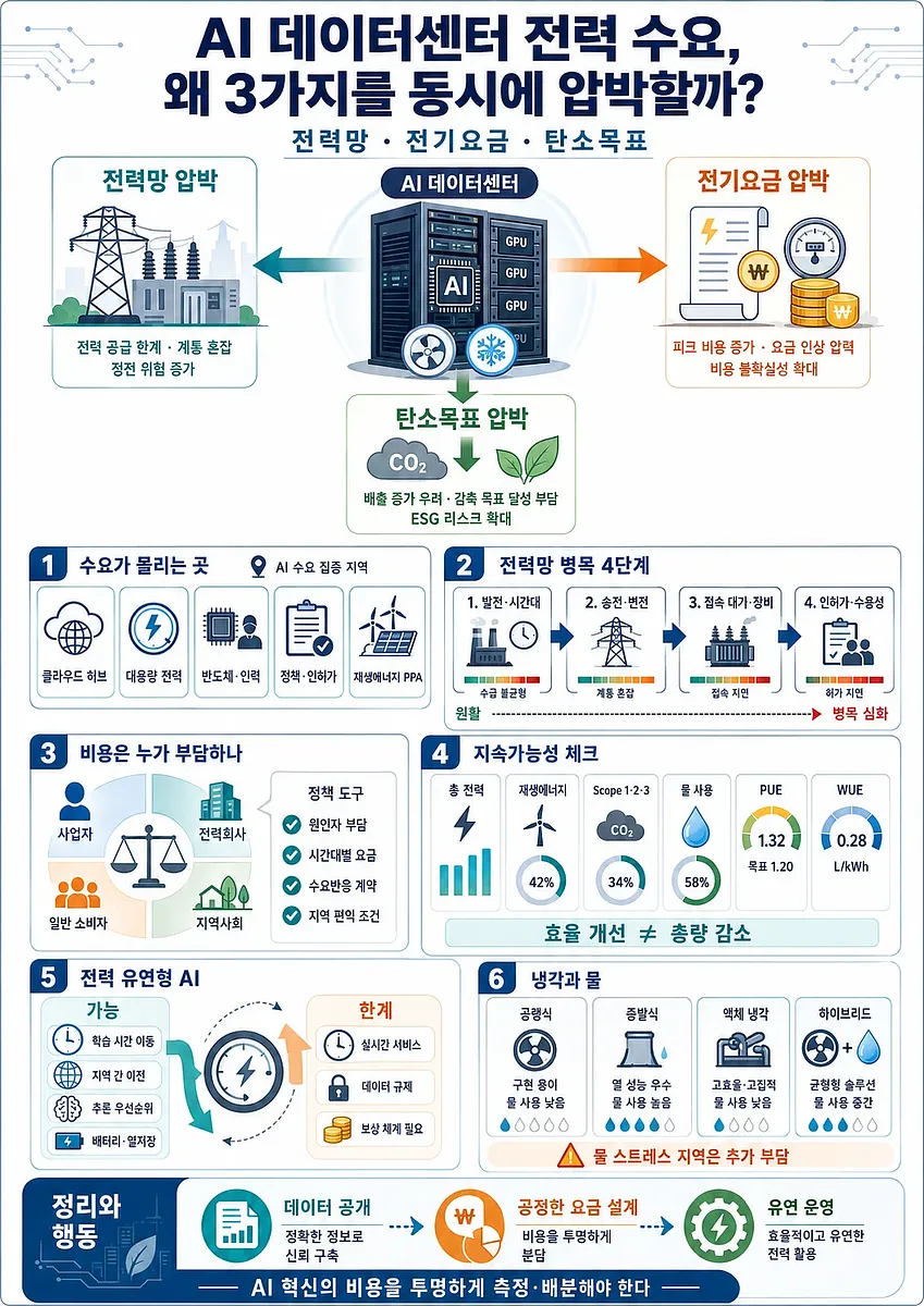
The infographic organizes how AI data centers affect grid bottlenecks, cost sharing, sustainability metrics, and flexible power-aware operations.
Why AI Data Center Power Demand Is Putting Pressure on the Power Grid, Electricity Rates, and Carbon Reduction Targets All at Once
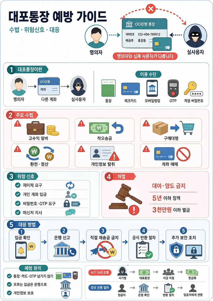
The infographic summarizes how mule accounts are misused and how to respond safely to suspicious deposits.
How Are "Ghost Accounts" Created, and How Can They Be Prevented?
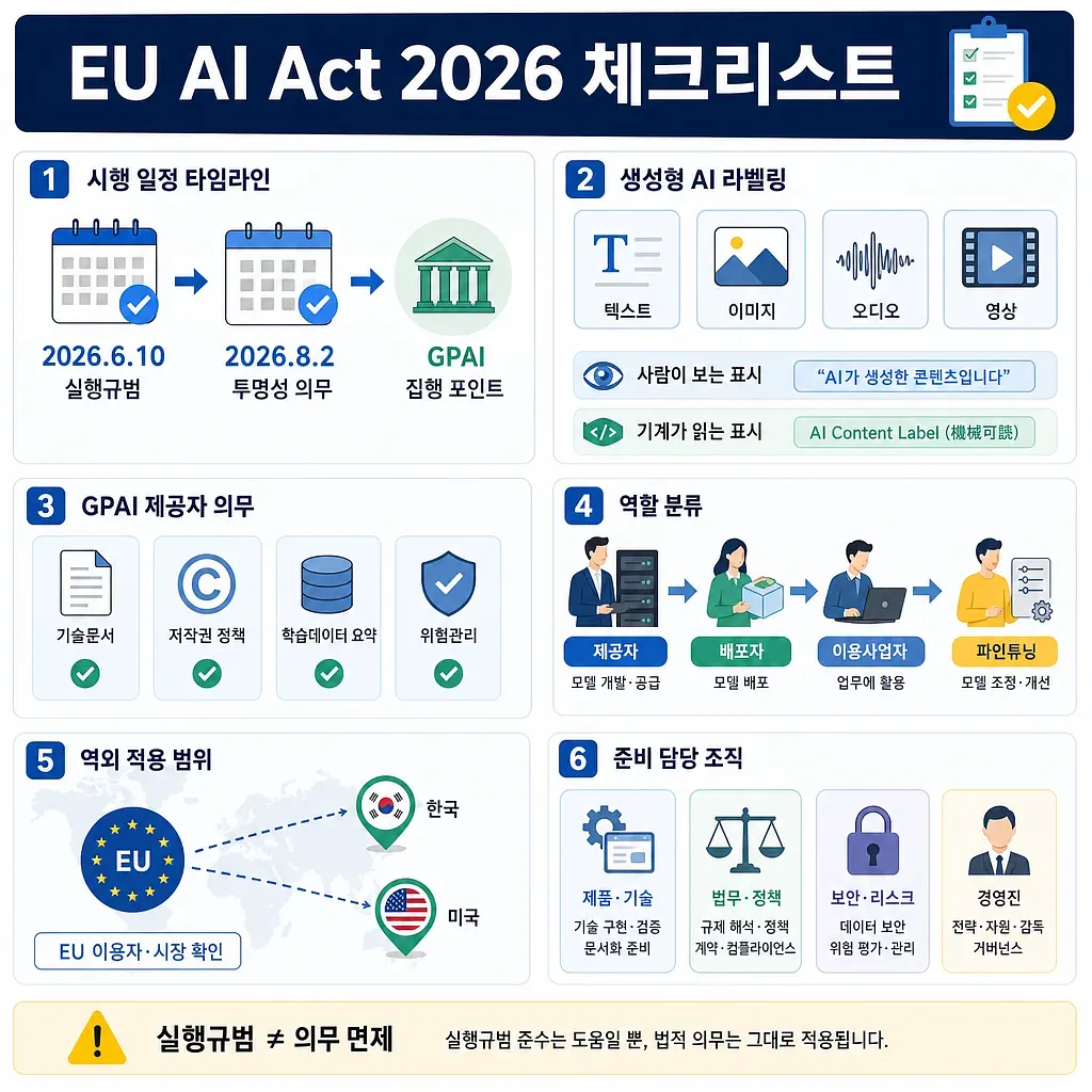
The graphic outlines timelines, AI labeling, GPAI duties, roles, scope, and responsible teams.
Checklist for the EU AI Act, Effective August 2026: Generative AI Labeling and GPAI Requirements
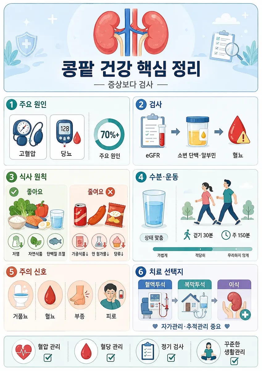
The infographic organizes chronic kidney disease prevention and care into causes, tests, diet, exercise, warning signs, and treatments.
How to Maintain Kidney Health: Understanding Diet, Exercise, Dialysis, and Transplantation for Chronic Kidney Disease
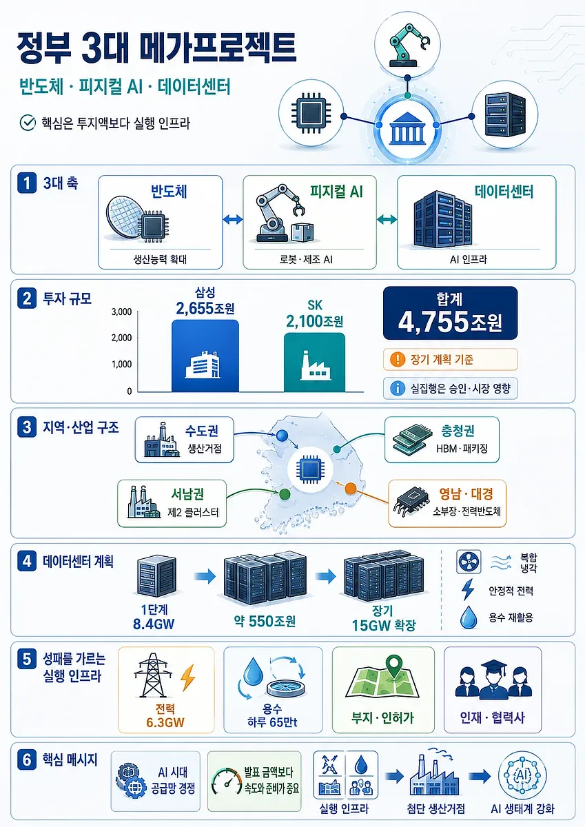
The infographic organizes the semiconductor, physical AI, data center strategy, and key execution infrastructure.
Summary of the Government’s Three Major Mega-Projects: Semiconductors, Physical AI, and Data Centers
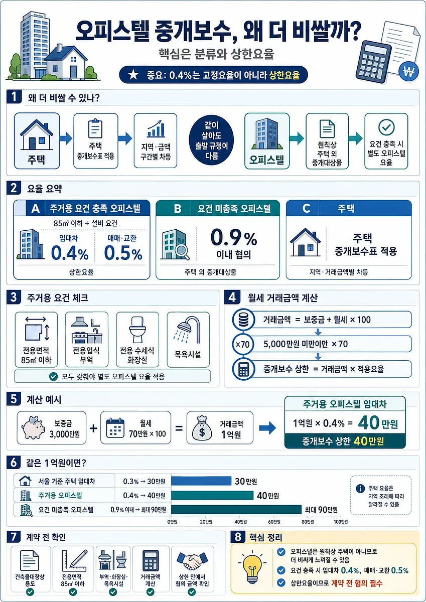
The infographic summarizes why officetel brokerage fees can be higher than housing fees and how the caps are calculated.
Why Office-Apartment Brokerage Commissions Are Higher Than Those for Residential Properties, and How They Are Calculated
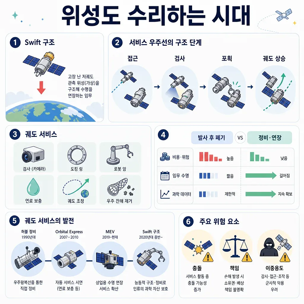
The graphic summarizes satellite servicing through the Swift rescue mission, including steps, benefits, and risks.
The Era of Repairing and Reusing Satellites: NASA’s Swift Rescue Mission and the Orbital Services Industry
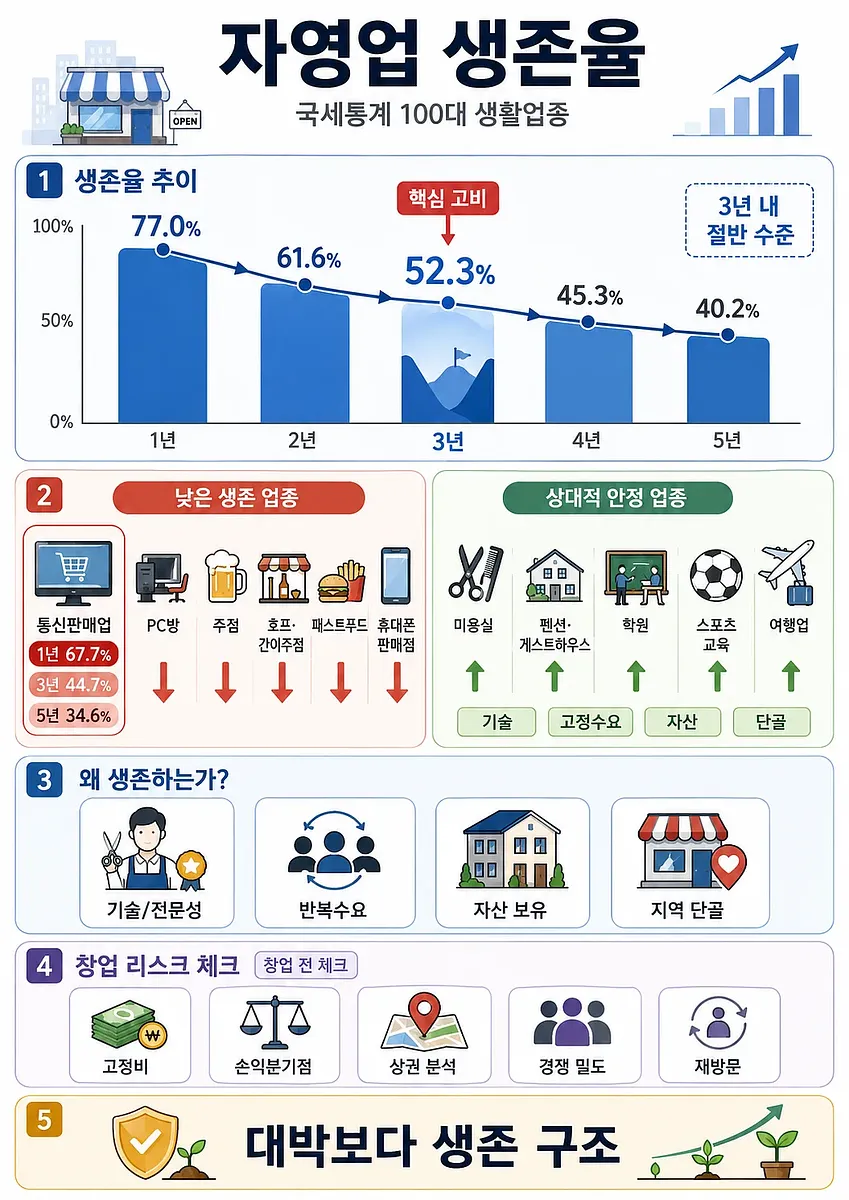
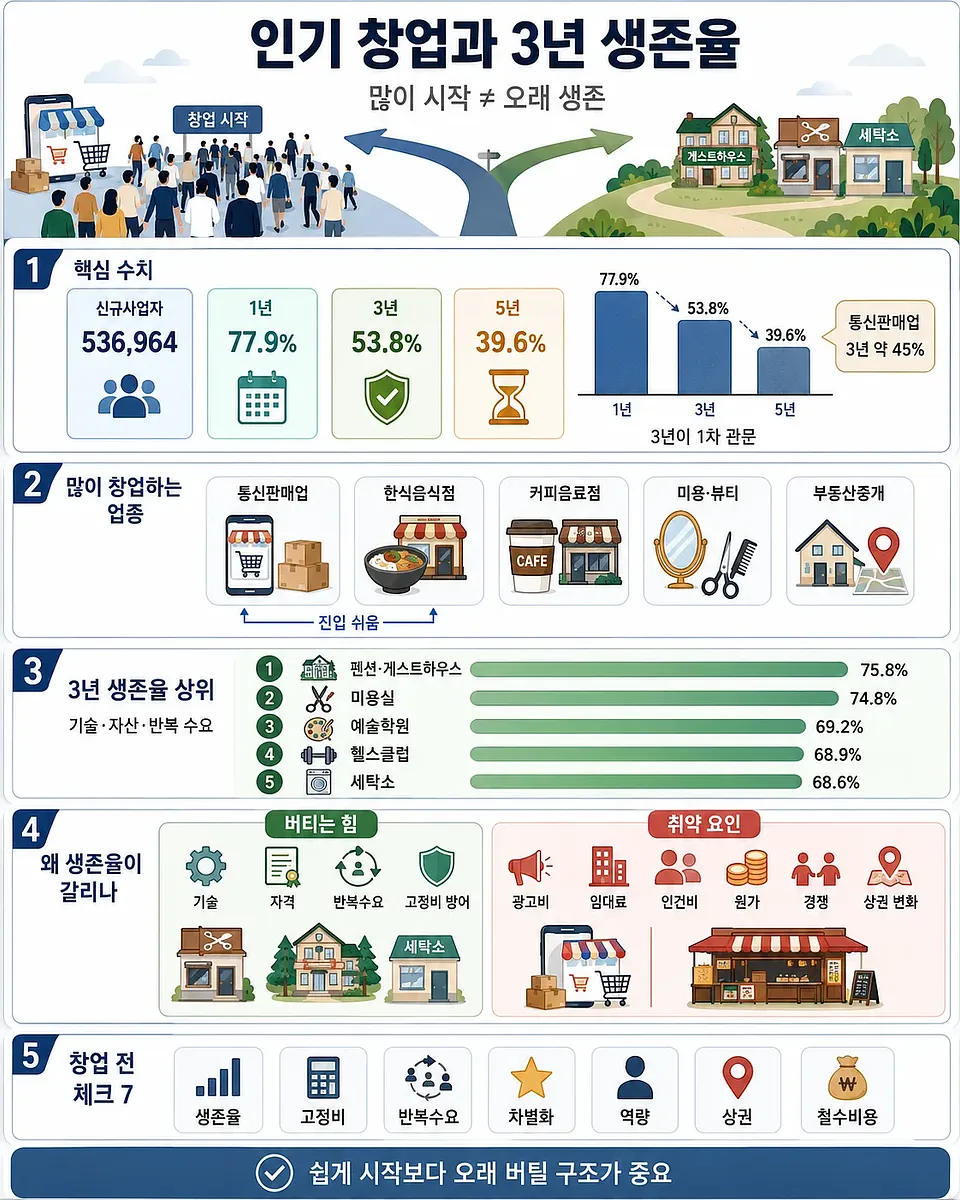
The infographic summarizes survival-rate trends, vulnerable industries, stable sectors, and key startup risk checks.
Survival Rates of Self-Employed Businesses Based on National Tax Statistics: Industries Where Half Disappear Within Three Years and Those That Endure
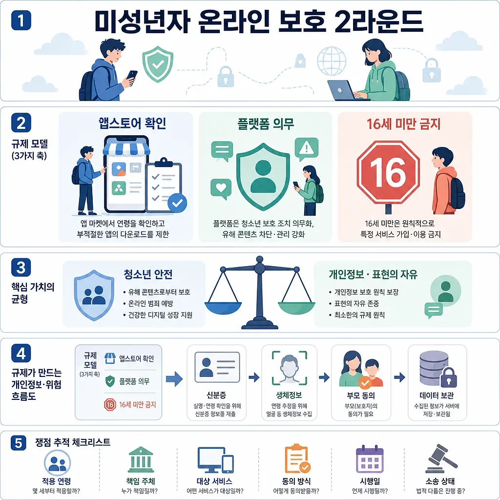
The graphic compares app store age checks, platform duties, under-16 restrictions, and data risks.
Round 2 of Online Protection for Minors: Age Verification on App Stores, Social Media Bans, and Comparison of Personal Information Risks
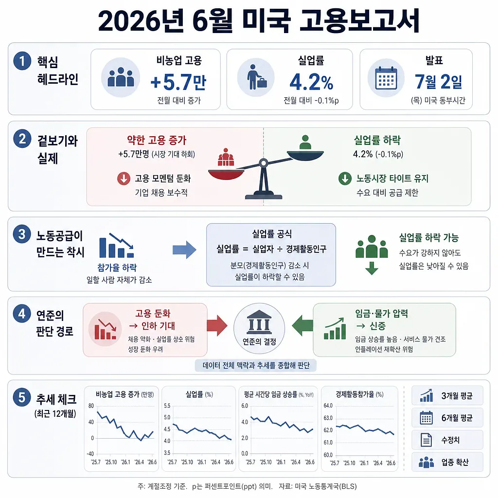
The graphic highlights 57,000 payroll gains, a 4.2% unemployment rate, and slowing labor supply.
Analysis of the U.S. June 2026 Employment Report: Labor Supply Slowdown Behind the Decline in the Unemployment Rate and Interest Rate Outlook
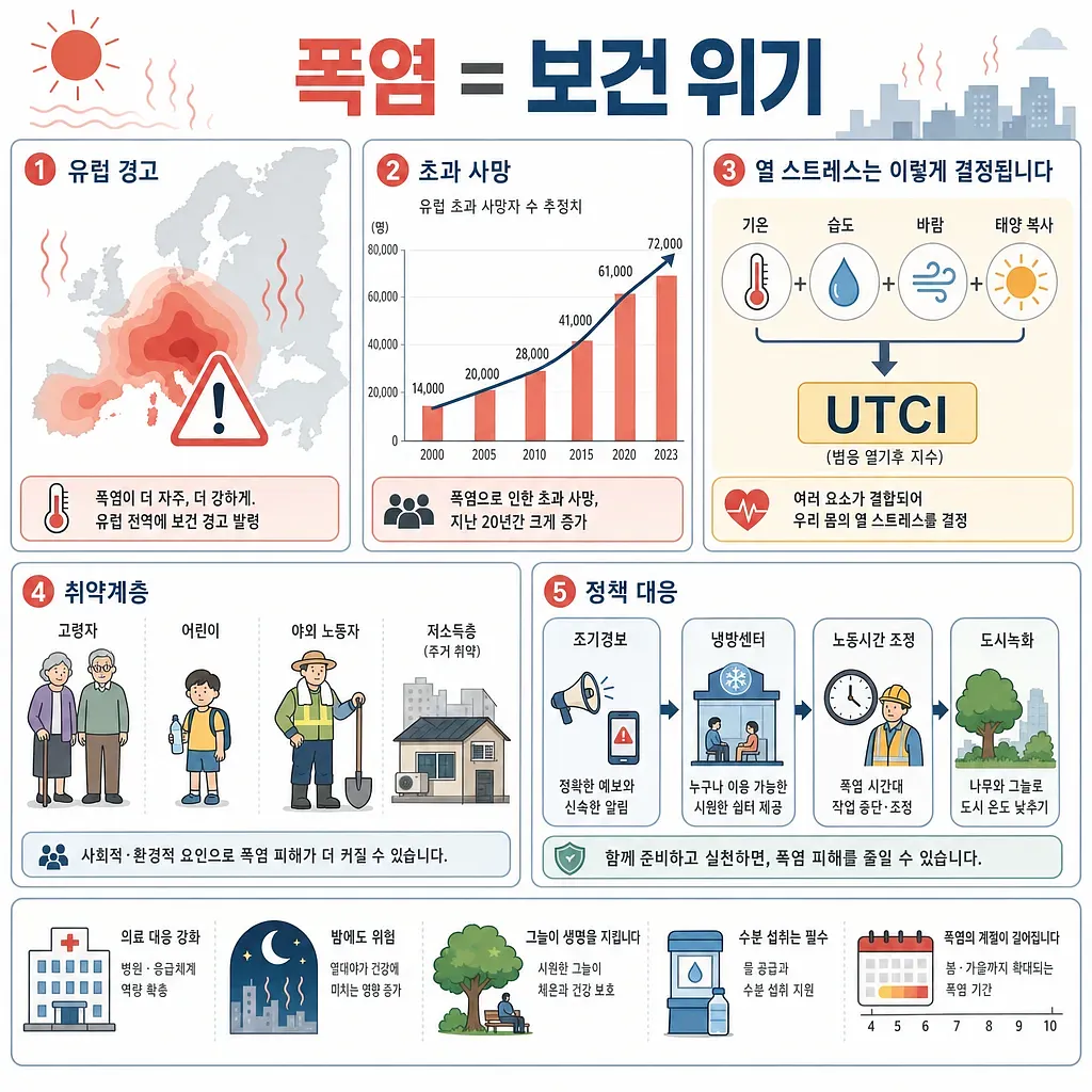
The graphic summarizes European heat alerts, rising excess deaths, heat stress factors, and policy responses.
Heat Waves Are No Longer Just “Weather”—They’re a Public Health Crisis: Reading About Rising Deaths in Europe and Global Heat Stress Research
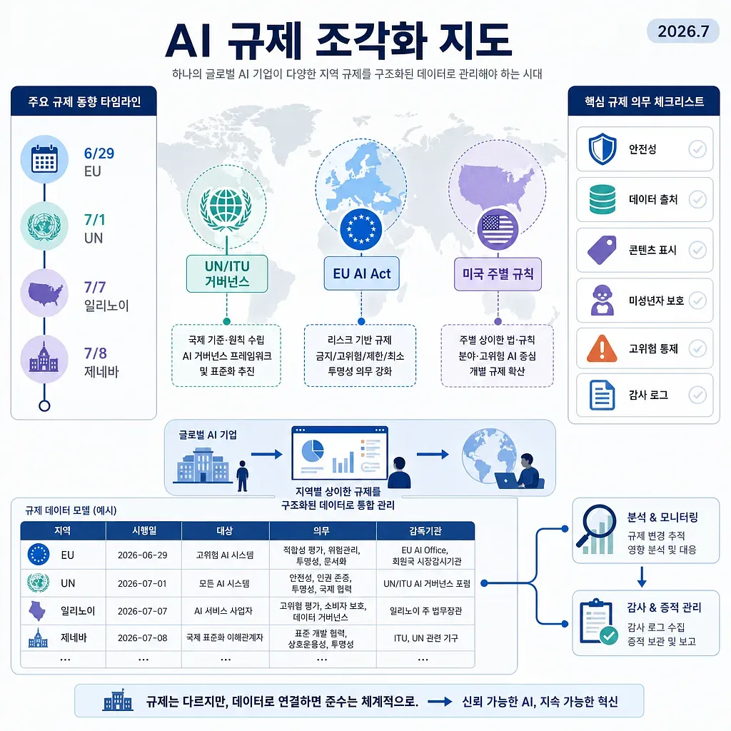
The infographic maps UN, EU, and U.S. state AI rules with timelines, duties, and compliance workflows.
Fragmentation of AI Regulation by Country: A Map of UN, EU, and U.S. State Regulations as of July 2026
The infographic compares startup statistics, business types, survival factors, risks, and preparation points.
Popular Startup Sectors and 3-Year Survival Rates Based on National Tax Statistics
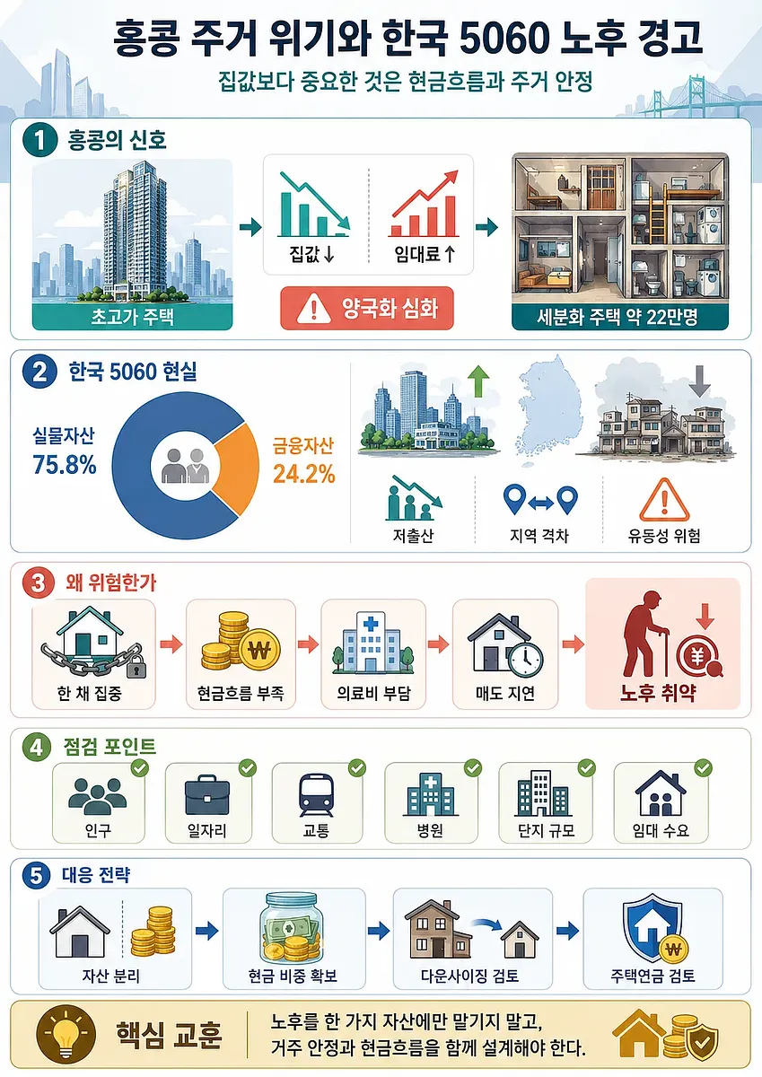
The infographic organizes housing inequality, asset concentration, retirement risks, and planning steps for Korea’s 5060 generation.
Hong Kong’s Housing Crisis: A Warning for South Koreans in Their 50s and 60s Regarding Retirement Assets
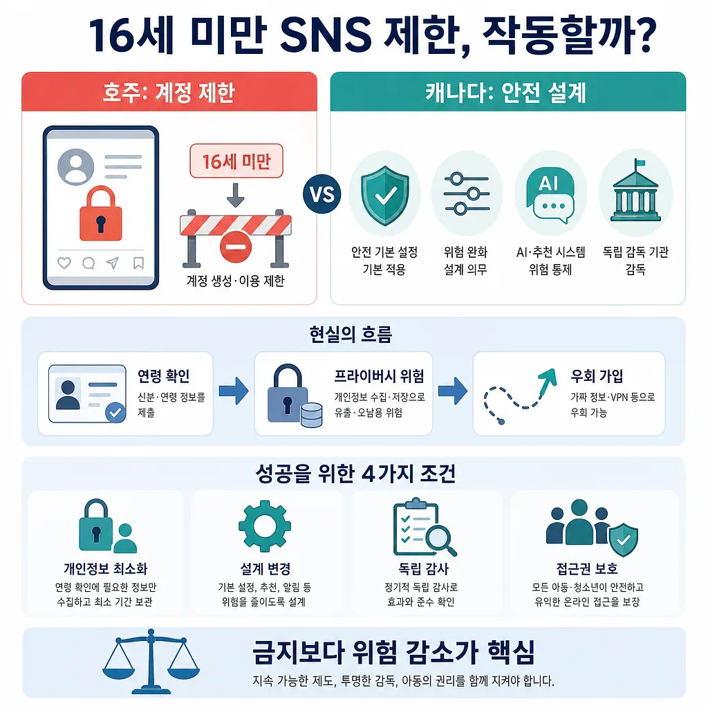
The graphic contrasts Australia’s account restrictions with Canada’s safety-by-design approach and key safeguards.
Will Social Media Restrictions for Children Under 16 Actually Work? A Comparison of Online Safety Regulations for Children in Australia and Canada
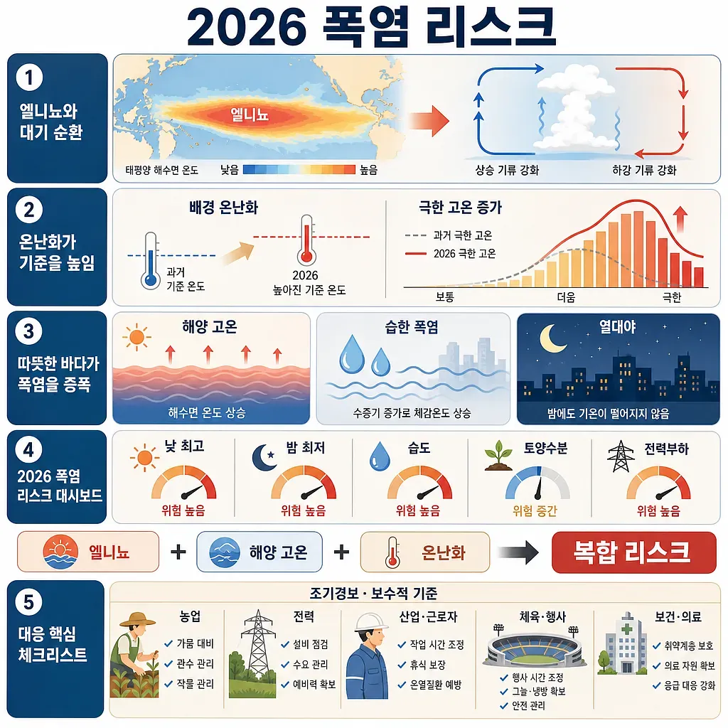
The chart summarizes 2026 heatwave risk through El Niño, marine heat, warming, and preparedness steps.
When El Niño and Ocean Warming Converge: Assessing the Risk of a Heat Wave in the Summer of 2026
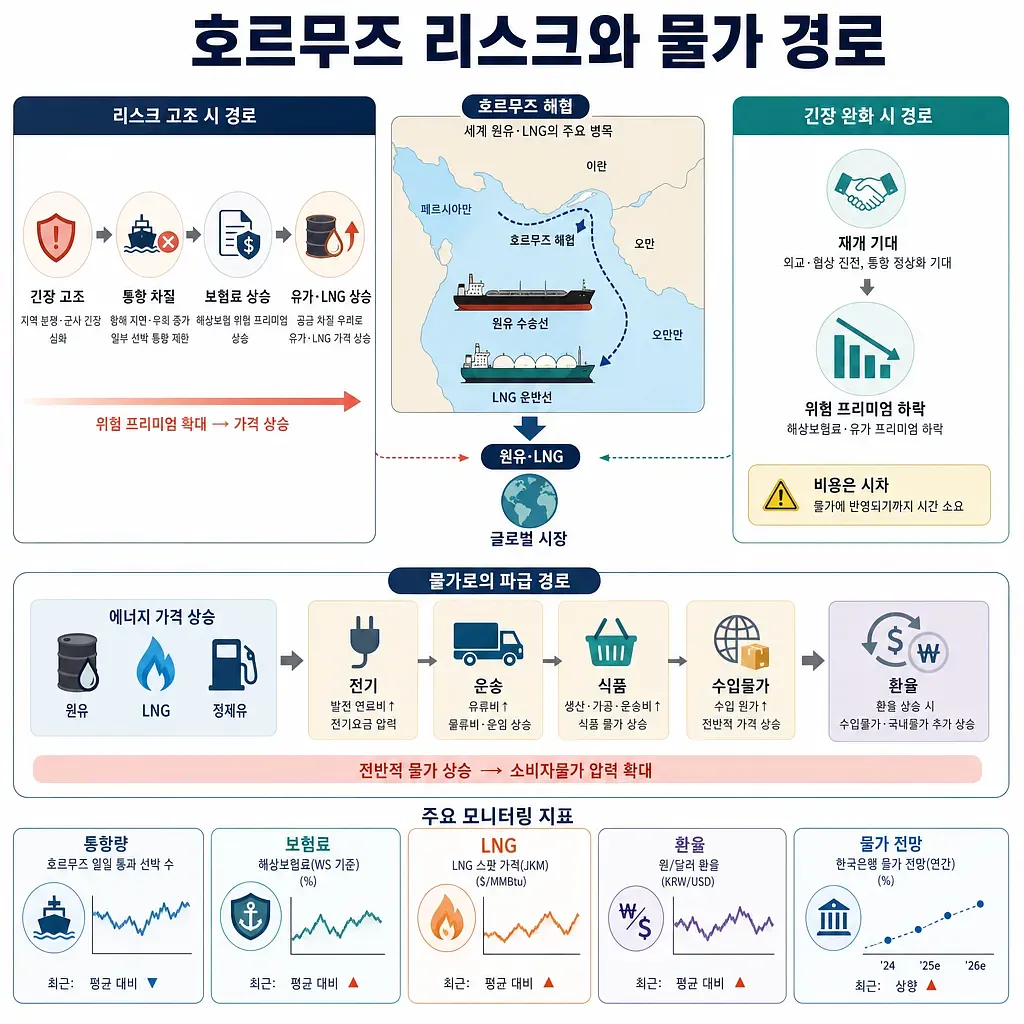
The graphic traces how tensions or easing can move energy prices, shipping, import costs, and exchange rates.
How Risks in the Strait of Hormuz Are Once Again Disrupting Oil Prices and Inflation
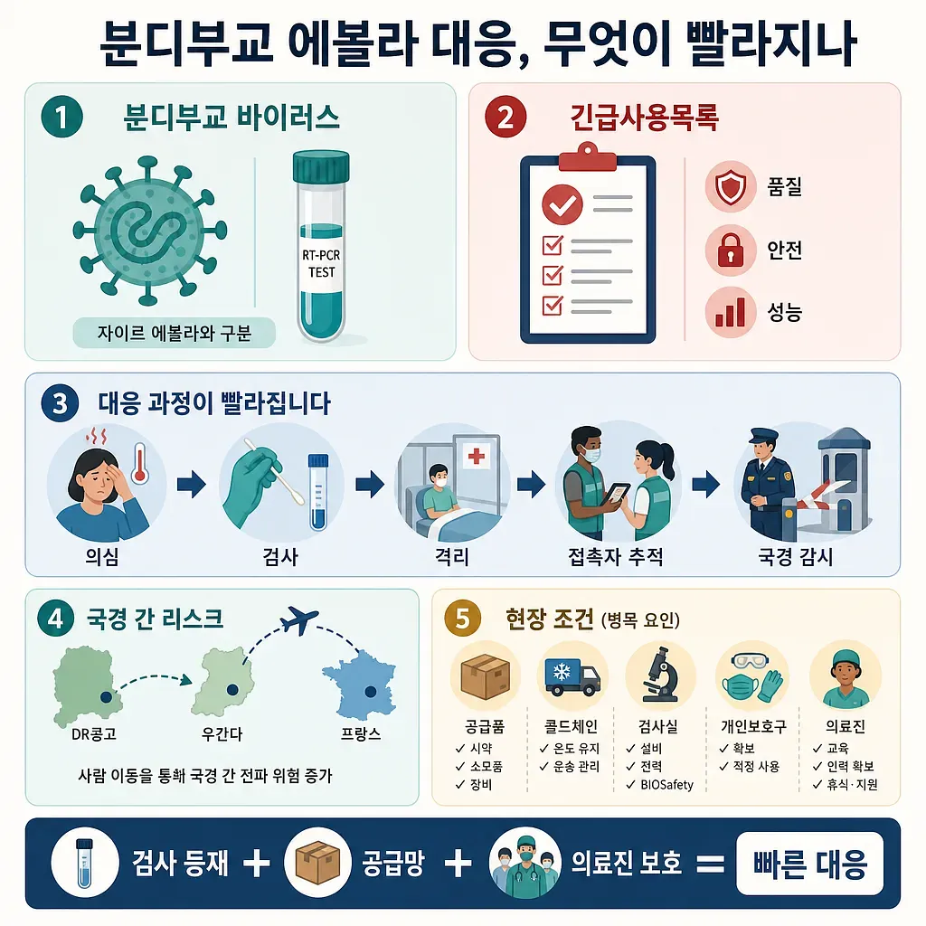
The graphic summarizes how WHO emergency-use diagnostics could speed the Bundibugyo Ebola response.
Will the Ebola Response in Bundibugyo Accelerate? The Significance of the WHO’s First Emergency Use Listing of a Diagnostic Test
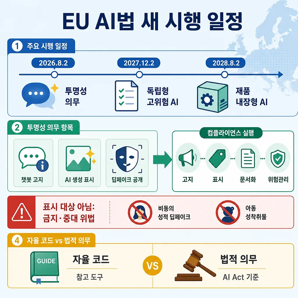
The graphic outlines key EU AI Act dates, labeling requirements, compliance steps, and legal obligations.
The EU AI Act’s implementation schedule has changed again: New standards for generative AI labeling and high-risk AI regulations
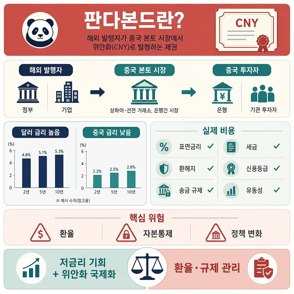
The graphic summarizes how overseas issuers sell yuan bonds in China’s mainland market.
Funds are pouring into the Chinese bond market.
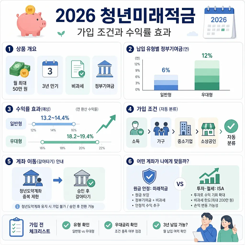
The graphic summarizes 2026 Youth Future Savings conditions, contribution types, expected returns, and account checks.
Eligibility Requirements and Return on Investment for the 2026 Youth Future Savings Account
 Injoys